Vimeo.com,
and then some.
Vimeo.com was, at one time, a very contemporary website. The only issue — that one time was in 2004. And since then, 15 years of design teams, and a one-page-at-a-time approach to UX, had left our brand and product feeling a scatterbrained. And our funnel a far cry from conversion-friendly.
If that wasn’t enough, Vimeo’s business was shifting drastically. From a content viewing destination, to a comprehensive set of tools for video creators. Or, if you’re an acronym person, an SVoD to a SaaS.
So this was our not-so-small challenge — create a user experience that continues to highlight all the amazing creators on Vimeo, and support a diehard base of users, all while educating potential new users about the tools we offer to help them become one of those amazing creators themselves.
ROLE
Design Direction
TEAM
Moazam Shah, Design
Graham Douglas, Creative Direction
Stephen Petrey, Development
Work & Co, Design & Development
A new look
(with an old soul).
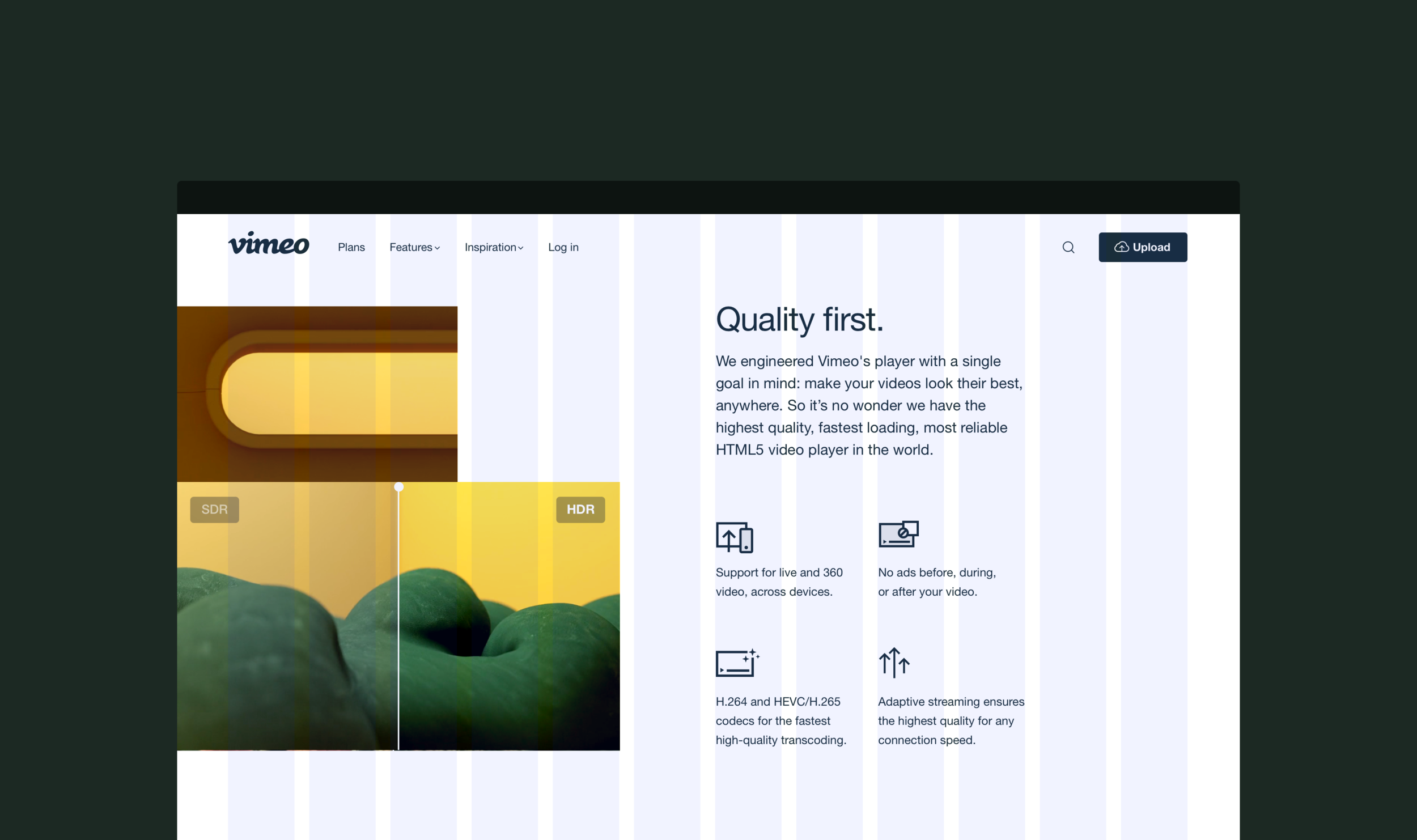
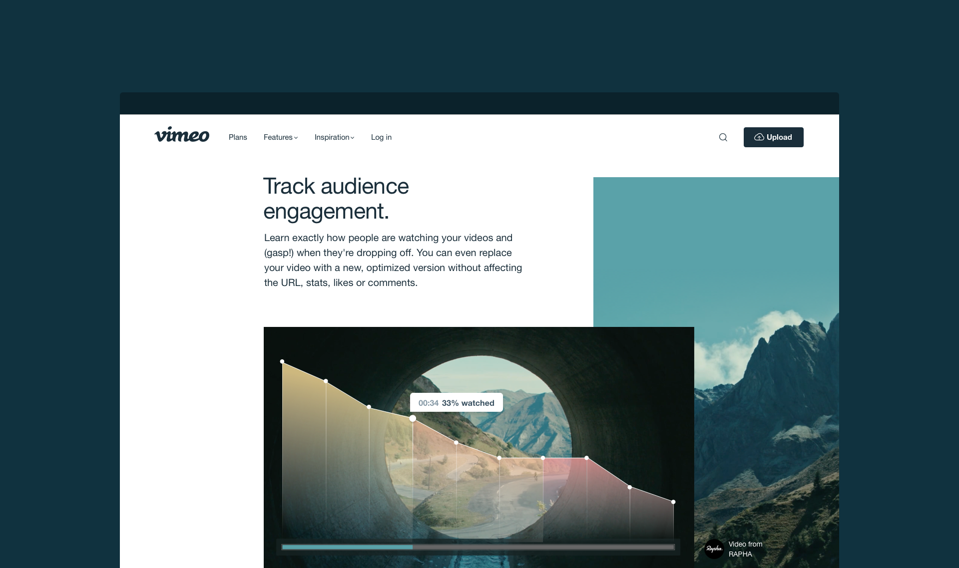
Vimeo is sitting on the most incredible storehouses of beautiful videos on the internet. And the last thing we wanted to do was scrub our face clean of that creative heritage. So we developed a style that simply presented our (pretty complicated) product, all through the lens of our amazing content.
Built for flexibility.
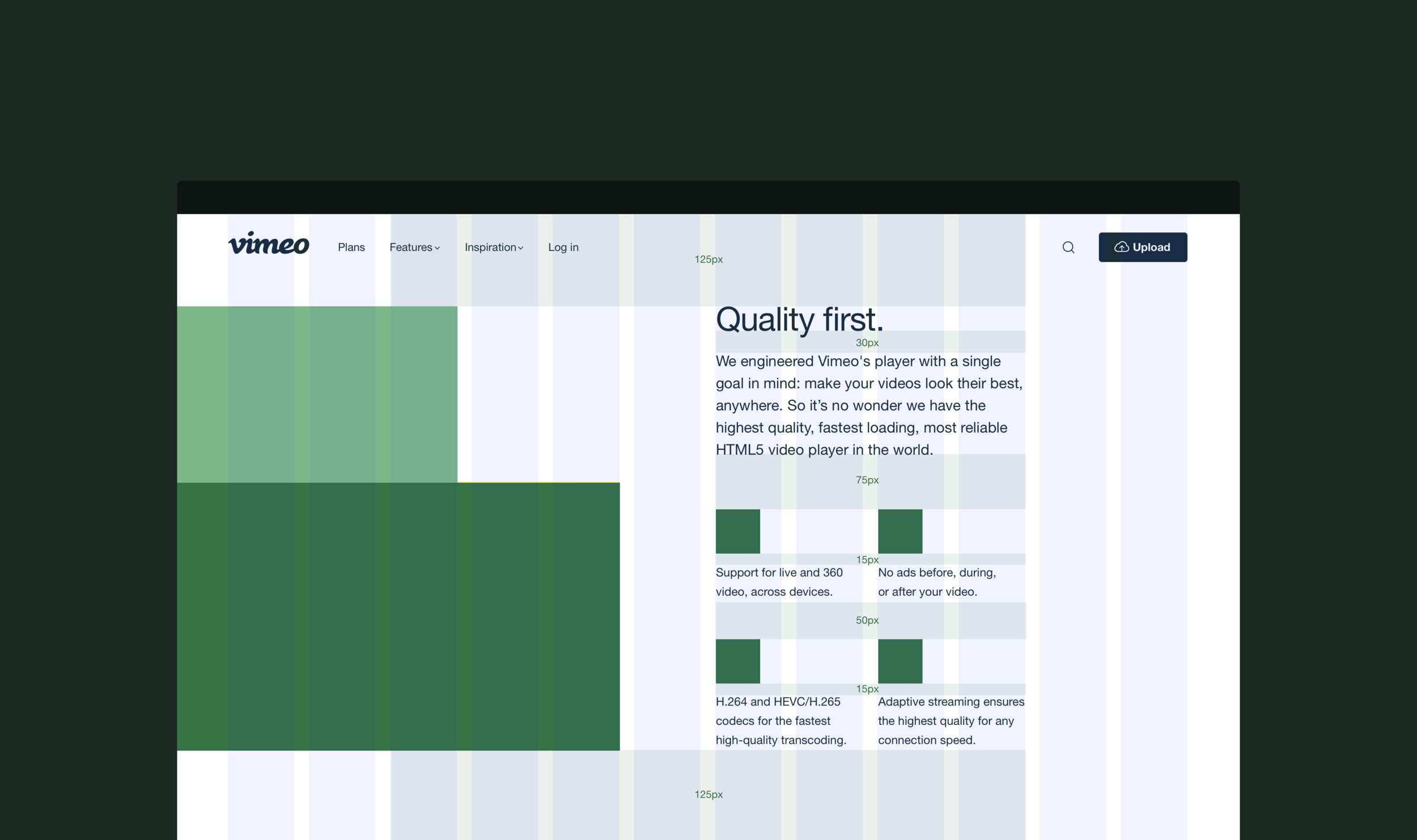
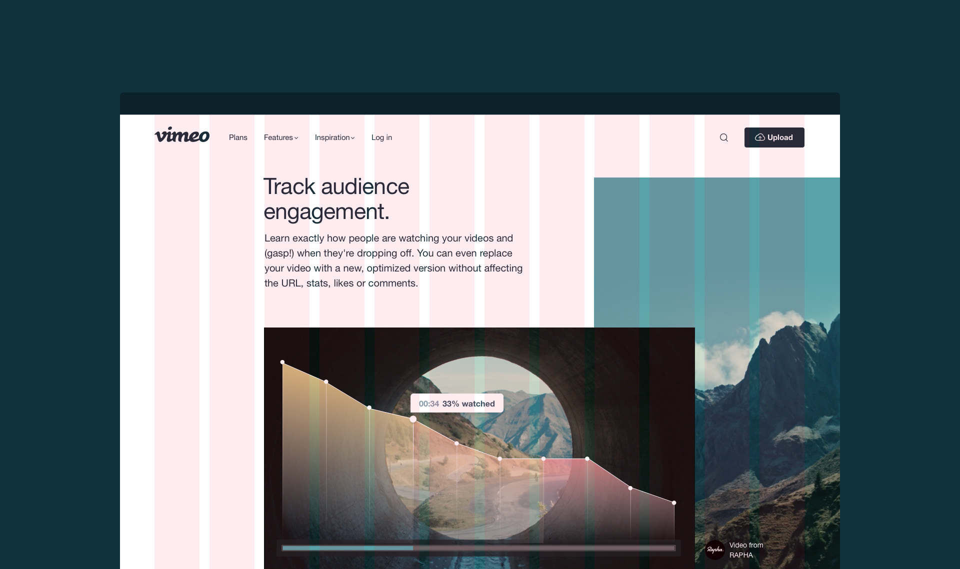
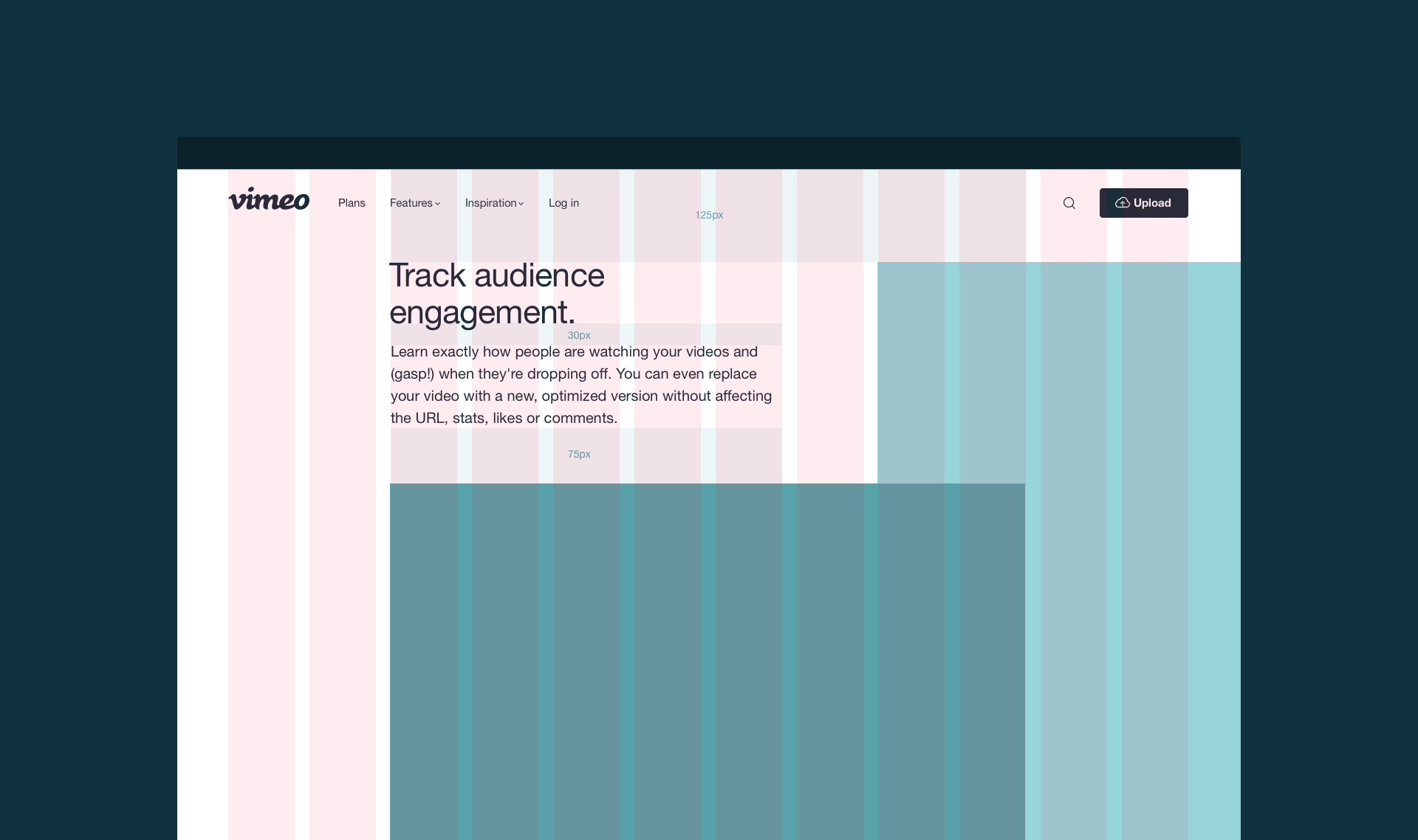
Vimeo’s product is rapidly changing. And so is our brand. So we needed to create a system that would allow for design and dev to keep pace. Our solution — a library of custom ReactJS components that let us build quickly, update frequently, remain totally responsive, and support 8 different languages. And counting.
Designed to inspire.
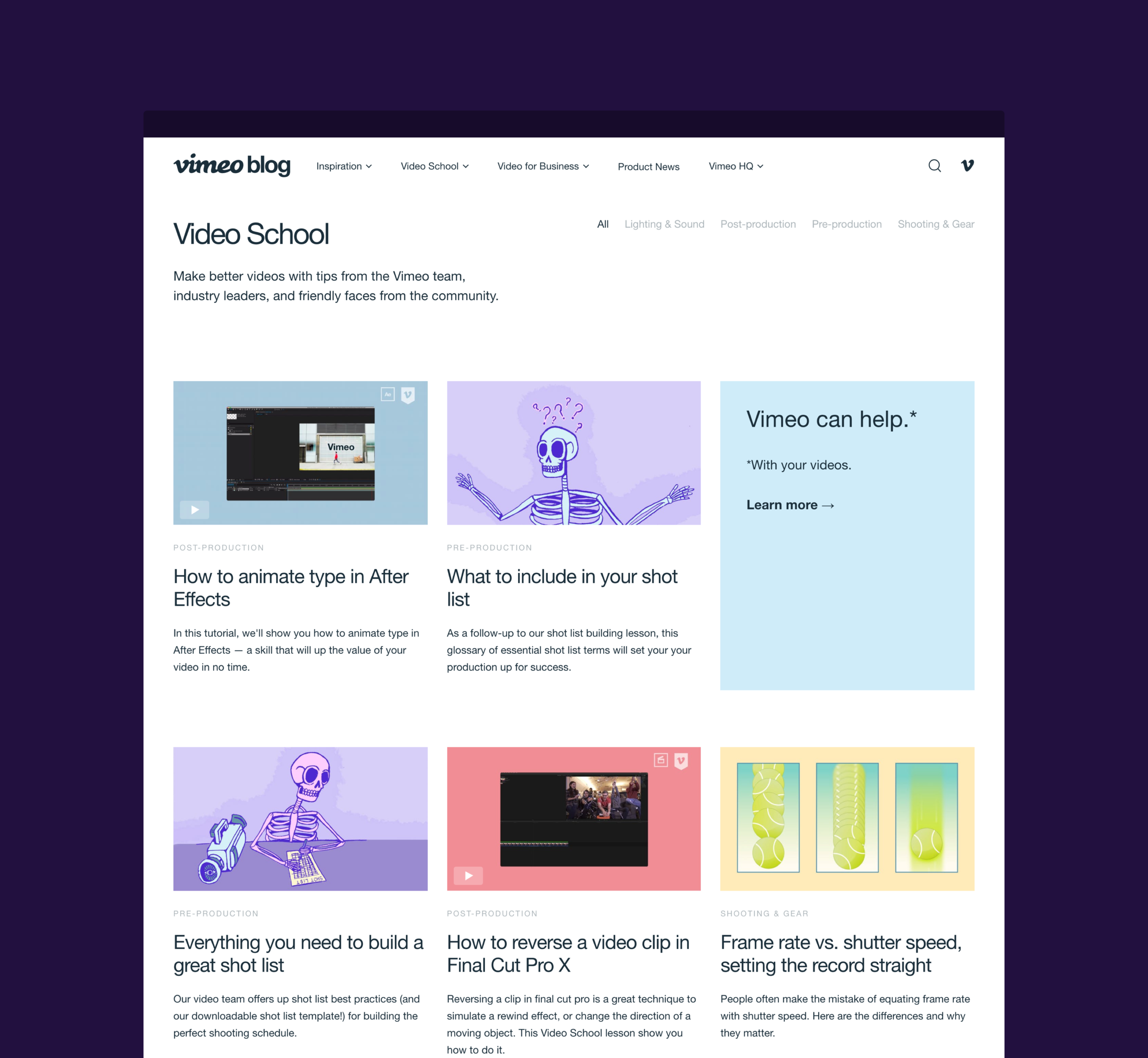
After establishing the new web styling, we set out to refresh other outdated pages across the vimeo.com universe, including a complete redesign of the Vimeo Blog.
Documenting the system.
In order to maintain consistency across a growing design team, we meticulously upkeep the web styling in the form of a style guide as well as a shared Sketch master components library.


